Panorama iPlayer Poster Refresh
Panorama iPlayer Poster Refresh
Panorama iPlayer Poster Refresh

Summary
Scroll to Discover
2026
Created a new iPlayer poster system and visual language for Panorama, modernising the programme’s presence on BBC iPlayer while maintaining a strong, recognisable brand.
Introducing a refreshed system and improved workflow, has successfully resulted in reducing design resources for iPlayer posters, smoother collaborating and the retention of Panorama’s large iPlayer audience.
Created a new iPlayer poster system and visual language for Panorama, modernising the programme’s presence on BBC iPlayer while maintaining a strong, recognisable brand.
Introducing a refreshed system and improved workflow, has successfully resulted in reducing design resources for iPlayer posters, smoother collaborating and the retention of Panorama’s large iPlayer audience.
Created a new iPlayer poster system and visual language for Panorama, modernising the programme’s presence on BBC iPlayer while maintaining a strong, recognisable brand.
Introducing a refreshed system and improved workflow, has successfully resulted in reducing design resources for iPlayer posters, smoother collaborating and the retention of Panorama’s large iPlayer audience.
Scroll to Discover

[001]
Why was a refresh needed?

There was no consistency or established visual language with Panorama’s old posters, apart from the midnight blue vignette which the producers at Panorama were keen to get rid of as they felt it made posters look cold.
We proposed a new branded template that offered greater flexibility while better meeting Panorama's editorial and production needs.
The existing workflow also presented opportunities for improvement, with multiple stakeholders, limited design resource and extensive feedback cycles making it challenging to deliver consistently high-quality creative work efficiently.
[001]
Why was a refresh needed?
There was no consistency or established visual language with Panorama’s old posters, apart from the midnight blue vignette which the producers at Panorama were keen to get rid of as they felt it made posters look cold.
We proposed a new branded template that offered greater flexibility while better meeting Panorama's editorial and production needs.
The existing workflow also presented opportunities for improvement, with multiple stakeholders, limited design resource and extensive feedback cycles making it challenging to deliver consistently high-quality creative work efficiently.
[001]
Why was a refresh needed?
There was no consistency or established visual language with Panorama’s old posters, apart from the midnight blue vignette which the producers at Panorama were keen to get rid of as they felt it made posters look cold.
We proposed a new branded template that offered greater flexibility while better meeting Panorama's editorial and production needs.
The existing workflow also presented opportunities for improvement, with multiple stakeholders, limited design resource and extensive feedback cycles making it challenging to deliver consistently high-quality creative work efficiently.
[002]
Research & Development

Before developing the new visual approach, I reviewed Panorama’s competitors in the UK alongside current affairs programmes from around the world.
Many international programmes, including Dateline, The Fifth Estate and Frontal, rely on templated thumbnails due to the nature of fast paced production time in current affairs programming.
While efficient, this approach did not align with Panorama’s editorial needs or the more bespoke creative direction adopted by their UK competitors.
[002]
Research & Development
Before developing the new visual approach, I reviewed Panorama’s competitors in the UK alongside current affairs programmes from around the world.
Many international programmes, including Dateline, The Fifth Estate and Frontal, rely on templated thumbnails due to the nature of fast paced production time in current affairs programming.
While efficient, this approach did not align with Panorama’s editorial needs or the more bespoke creative direction adopted by their UK competitors.
[002]
Research & Development
Before developing the new visual approach, I reviewed Panorama’s competitors in the UK alongside current affairs programmes from around the world.
Many international programmes, including Dateline, The Fifth Estate and Frontal, rely on templated thumbnails due to the nature of fast paced production time in current affairs programming.
While efficient, this approach did not align with Panorama’s editorial needs or the more bespoke creative direction adopted by their UK competitors.
[03]
Research

A short survey was also conducted on over 135 participants to identify how much should Panorama’s branding influence the new template’s design.
The research showed that Panorama had strong brand recognition amongst the participants. However, the research concluded that they were neither more nor less likely to click on a thumbnail with the Panorama Logo on.
Instead, the final design would use Panorama's brand colours as a more subtle identifier. However, the blue would be reduced to fulfil Panorama’s production requirements.
[03]
Research
A short survey was also conducted on over 135 participants to identify how much should Panorama’s branding influence the new template’s design.
The research showed that Panorama had strong brand recognition amongst the participants. However, the research concluded that they were neither more nor less likely to click on a thumbnail with the Panorama Logo on.
Instead, the final design would use Panorama's brand colours as a more subtle identifier. However, the blue would be reduced to fulfil Panorama’s production requirements.
[03]
Research
A short survey was also conducted on over 135 participants to identify how much should Panorama’s branding influence the new template’s design.
The research showed that Panorama had strong brand recognition amongst the participants. However, the research concluded that they were neither more nor less likely to click on a thumbnail with the Panorama Logo on.
Instead, the final design would use Panorama's brand colours as a more subtle identifier. However, the blue would be reduced to fulfil Panorama’s production requirements.
[004]
Experimentation

Multiple visual treatments were explored to identify the most effective direction for Panorama’s new iPlayer poster system. To test different approaches, a series of fictional episodes, including The Price of Silence and The New Iron Curtain, were created, allowing for experimentation with more cinematic composites.
The composite approach drew inspiration from ABC’s Four Corners, whose thumbnails demonstrate how current affairs thumbnails can feel both editorially authoritative and visually cinematic.
[004]
Experimentation
Multiple visual treatments were explored to identify the most effective direction for Panorama’s new iPlayer poster system. To test different approaches, a series of fictional episodes, including The Price of Silence and The New Iron Curtain, were created, allowing for experimentation with more cinematic composites.
The composite approach drew inspiration from ABC’s Four Corners, whose thumbnails demonstrate how current affairs thumbnails can feel both editorially authoritative and visually cinematic.
[004]
Experimentation
Multiple visual treatments were explored to identify the most effective direction for Panorama’s new iPlayer poster system. To test different approaches, a series of fictional episodes, including The Price of Silence and The New Iron Curtain, were created, allowing for experimentation with more cinematic composites.
The composite approach drew inspiration from ABC’s Four Corners, whose thumbnails demonstrate how current affairs thumbnails can feel both editorially authoritative and visually cinematic.
[005]
Refresh

The proposed visual refresh was introduced alongside a new workflow and production system for creating Panorama's iPlayer posters.
The redesign replaced the existing blue vignette with a subtle midnight-blue gradient, softly curved across the bottom of the composition. This improved text legibility, reduced visual clutter, and introduced greater flexibility for colour, a key requirement from Panorama.
Each style of poster is approached differently. Styles 01 and 02 support the fast turnaround required for regular episodes, while Style 03 is reserved for their set pieces where additional lead time is needed.
[005]
Refresh
The proposed visual refresh was introduced alongside a new workflow and production system for creating Panorama's iPlayer posters.
The redesign replaced the existing blue vignette with a subtle midnight-blue gradient, softly curved across the bottom of the composition. This improved text legibility, reduced visual clutter, and introduced greater flexibility for colour, a key requirement from Panorama.
Each style of poster is approached differently. Styles 01 and 02 support the fast turnaround required for regular episodes, while Style 03 is reserved for their set pieces where additional lead time is needed.
[005]
Refresh
The proposed visual refresh was introduced alongside a new workflow and production system for creating Panorama's iPlayer posters.
The redesign replaced the existing blue vignette with a subtle midnight-blue gradient, softly curved across the bottom of the composition. This improved text legibility, reduced visual clutter, and introduced greater flexibility for colour, a key requirement from Panorama.
Each style of poster is approached differently. Styles 01 and 02 support the fast turnaround required for regular episodes, while Style 03 is reserved for their set pieces where additional lead time is needed.
[006]
Our Man in Moscow

The new template applied to Our Man in Moscow, one of Panorama’s set piece programmes and among the final programme to use the previous poster system.
[006]
Our Man in Moscow
The new template applied to Our Man in Moscow, one of Panorama’s set piece programmes and among the final programme to use the previous poster system.
[006]
Our Man in Moscow
The new template applied to Our Man in Moscow, one of Panorama’s set piece programmes and among the final programme to use the previous poster system.
[007]
Zelenskyy at War: Leadership Under Fire Mockup

A fictional Panorama episode was created to mock-up a more cinematic approach to poster design. Working with a new brief encouraged fresh creative thinking and helped avoid being constrained by the visual conventions of previous episodes.
[007]
Zelenskyy at War: Leadership Under Fire Mockup
A fictional Panorama episode was created to mock-up a more cinematic approach to poster design. Working with a new brief encouraged fresh creative thinking and helped avoid being constrained by the visual conventions of previous episodes.
[007]
Zelenskyy at War: Leadership Under Fire Mockup
A fictional Panorama episode was created to mock-up a more cinematic approach to poster design. Working with a new brief encouraged fresh creative thinking and helped avoid being constrained by the visual conventions of previous episodes.
[008]
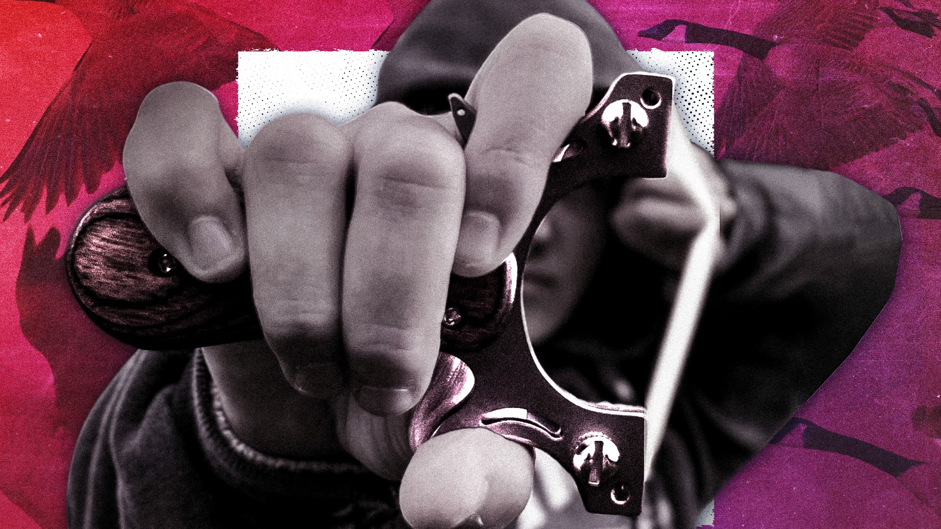
Knife Crime: What Happened to our Boys?

Another previously existing episode of Panorama with the new template applied. This helped assess the flexibility and robustness of the system, ensuring it could adapt to a variety of stories.
[008]
Knife Crime: What Happened to our Boys?
Another previously existing episode of Panorama with the new template applied. This helped assess the flexibility and robustness of the system, ensuring it could adapt to a variety of stories.
[008]
Knife Crime: What Happened to our Boys?
Another previously existing episode of Panorama with the new template applied. This helped assess the flexibility and robustness of the system, ensuring it could adapt to a variety of stories.
[009]
The New Iron Curtain: Putin's War in Europe Mockup

Another fictional episode of Panorama, created to explore the potential of the programme’s new cinematic visual identity.
[009]
The New Iron Curtain: Putin's War in Europe Mockup
Another fictional episode of Panorama, created to explore the potential of the programme’s new cinematic visual identity.
[009]
The New Iron Curtain: Putin's War in Europe Mockup
Another fictional episode of Panorama, created to explore the potential of the programme’s new cinematic visual identity.
More Projects.
From full graphic suites for documentaries, personal branding projects and a released PC game.
Each project has been thoughtfully designed to enhance storytelling and deliver meaningful results for audiences.